
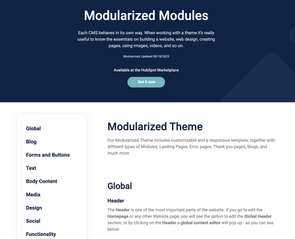
Modularized Theme
Our Modularized Theme includes customizable and a responsive template, together with different types of Modules, Landing Pages, Error pages, Thank you pages, Blogs, and much more.
Global
Header
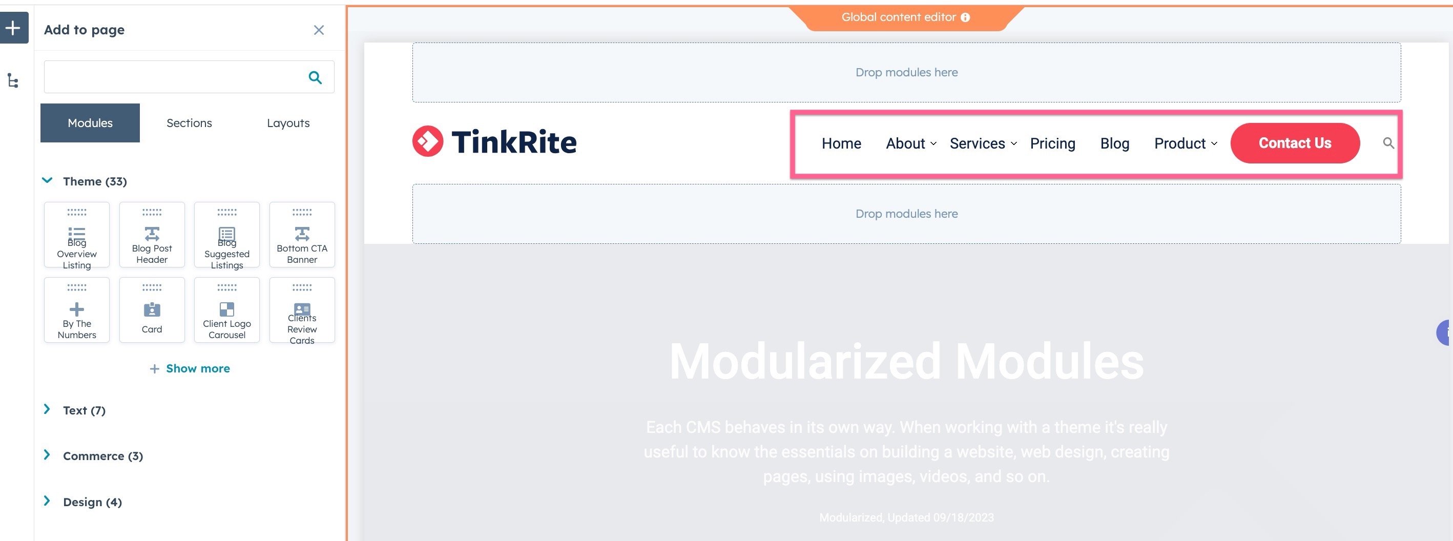
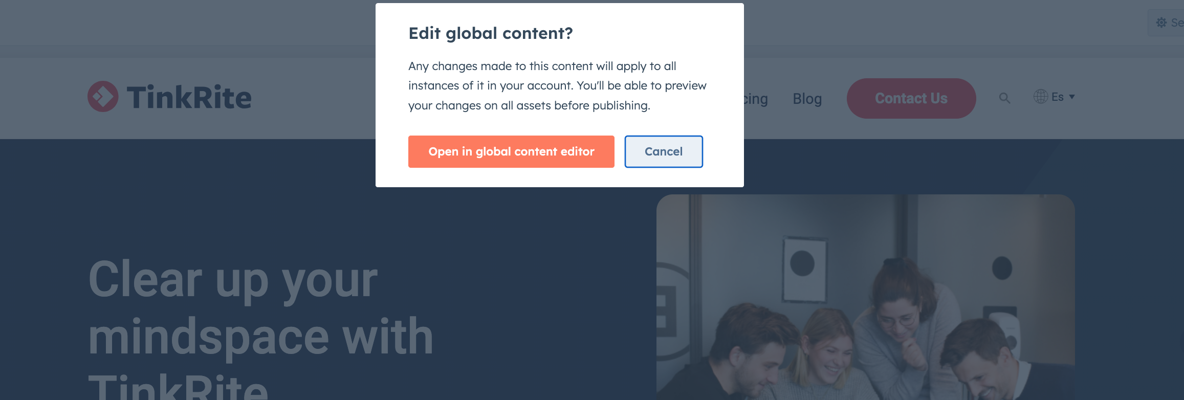
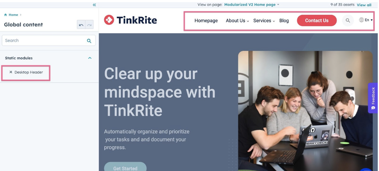
The Header is one of the most important parts of the website. If you go to edit
the Homepage or any other Website page, you will see the option to edit the Global Header section, or by clicking on the Header a global content editor will pop up - as you can see below:
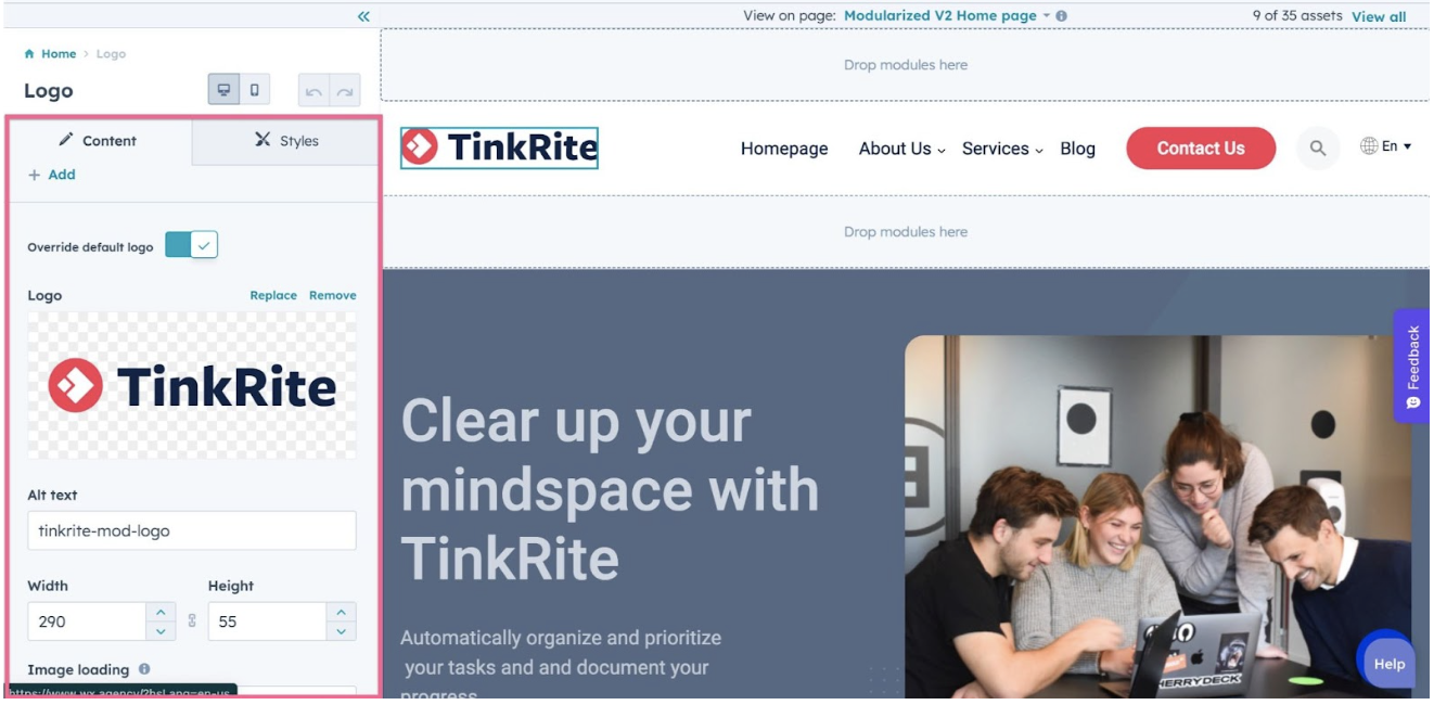
Logo
In the Global header section, you will be able to click the logo, and you will see the sidebar options to edit it, as you can see below:
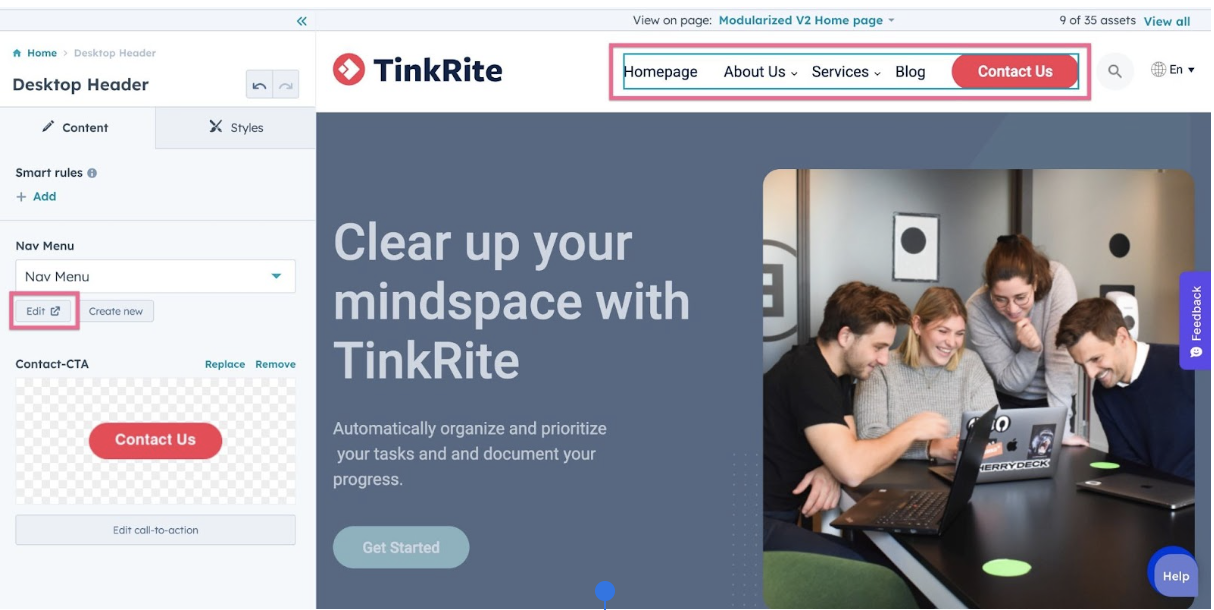
Menu Links
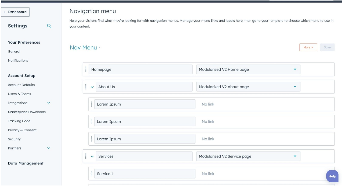
Once you finish with the logo, let’s continue with the Menu Links. All the menu links are managed on the Navigation section within the Website settings on HubSpot, so it’s very likely you are already familiar with how to edit them.
If not, don’t worry, go to Settings > Website > Navigation. The screen will look something like this:
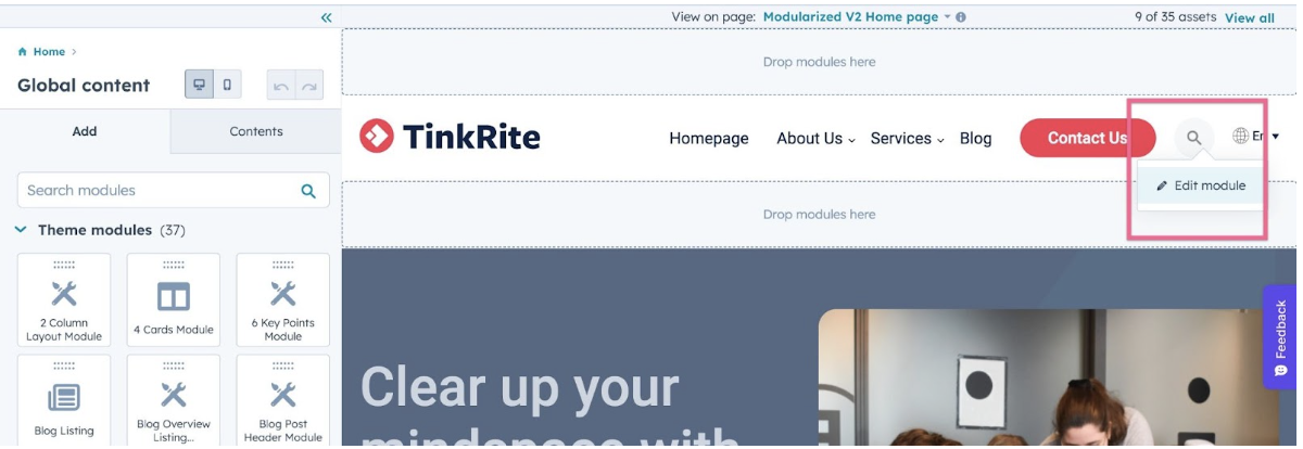
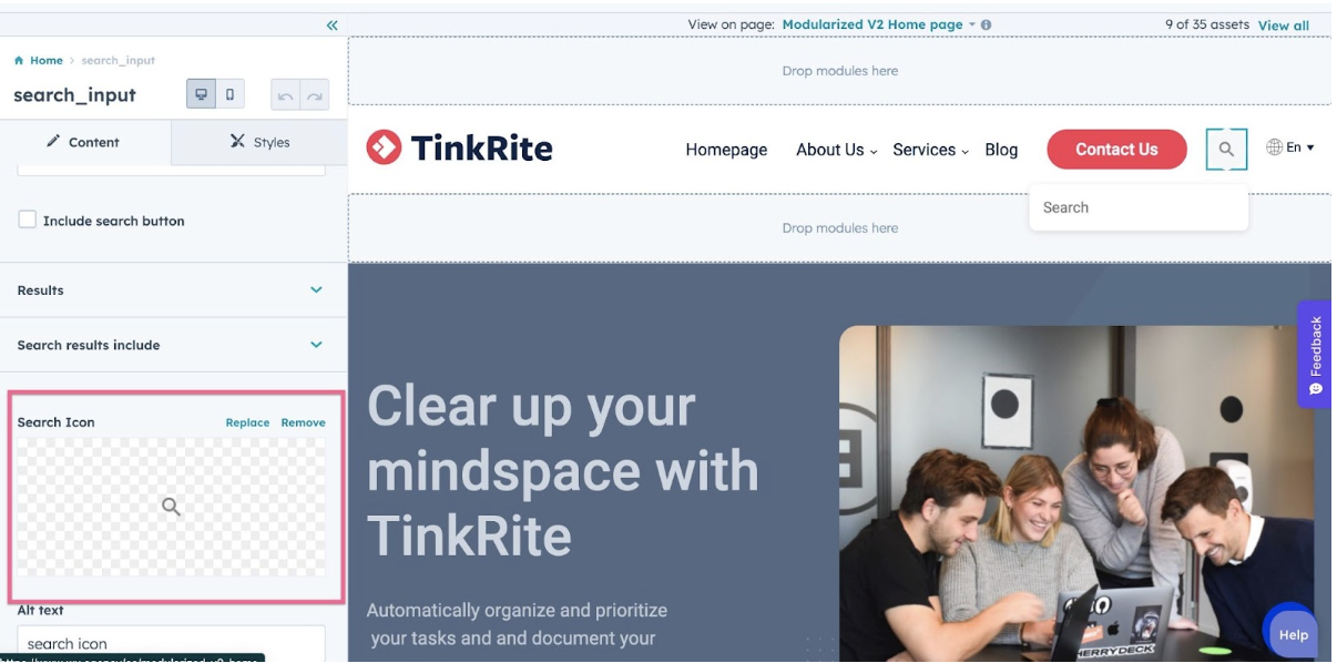
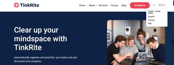
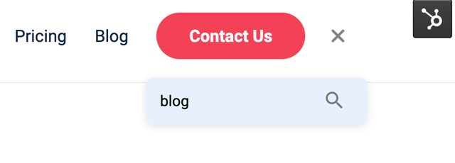
Search Bar
In the header section, there's a search bar. If you don’t need the search bar there is an option to hide it. Please check the below images for reference.
Alternatively you can go to Settings > Website > Navigation. The screen will look like this:
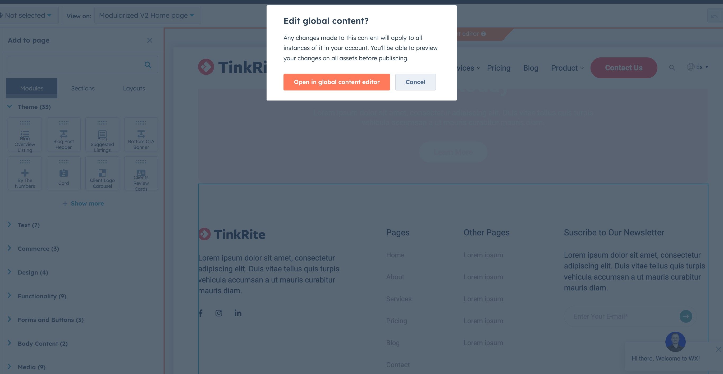
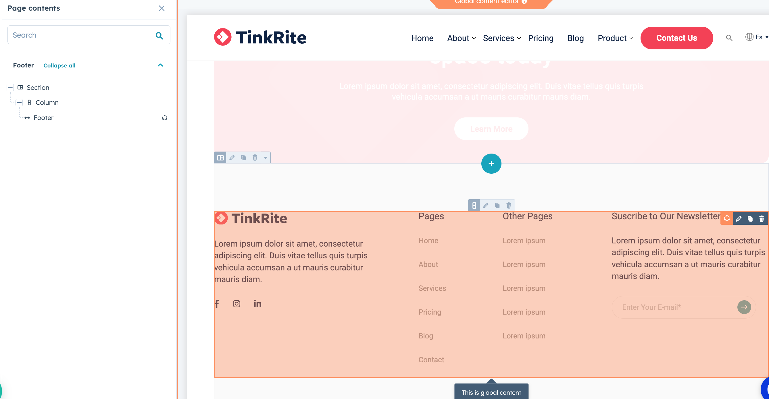
Footer
Editing the Footer is pretty much the same process as the Header. In order to edit the Global Footer section, you need to edit any Website page, scroll to the bottom, and you will find the footer.
Click Edit Module, and you will be redirected to the screen to start editing the footer:
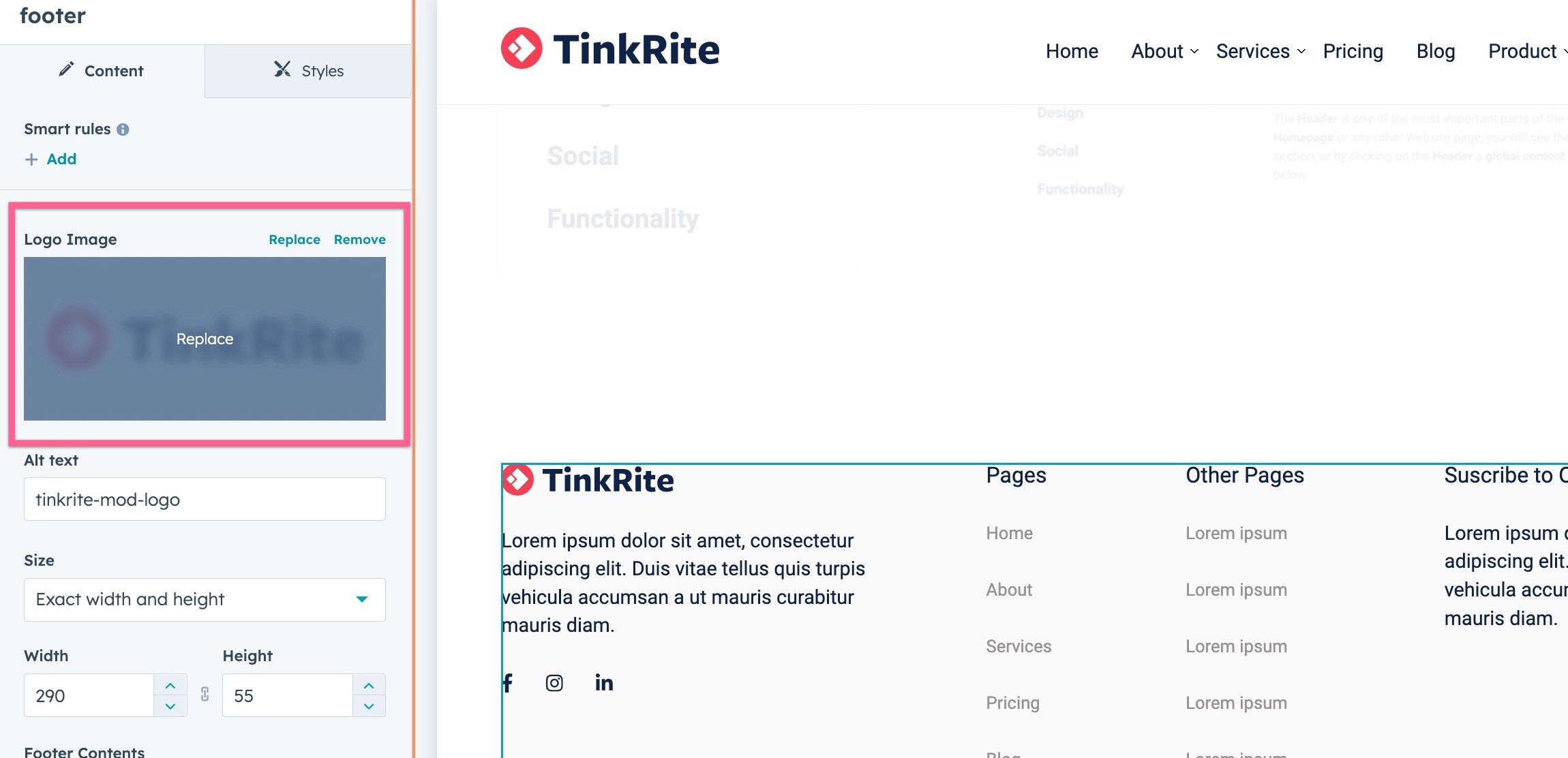
Logo
Once you are in the Footer editor, click the Footer logo, and you will be able to edit it and upload your company logo.
Just like on the header, we recommend you to upload the logo as SVG format (Scalable Vector Graphics) as it will be super light and look perfectly sharp on every device. However, if you don’t have a vector version of your logo, a PNG or JPG will work great too.
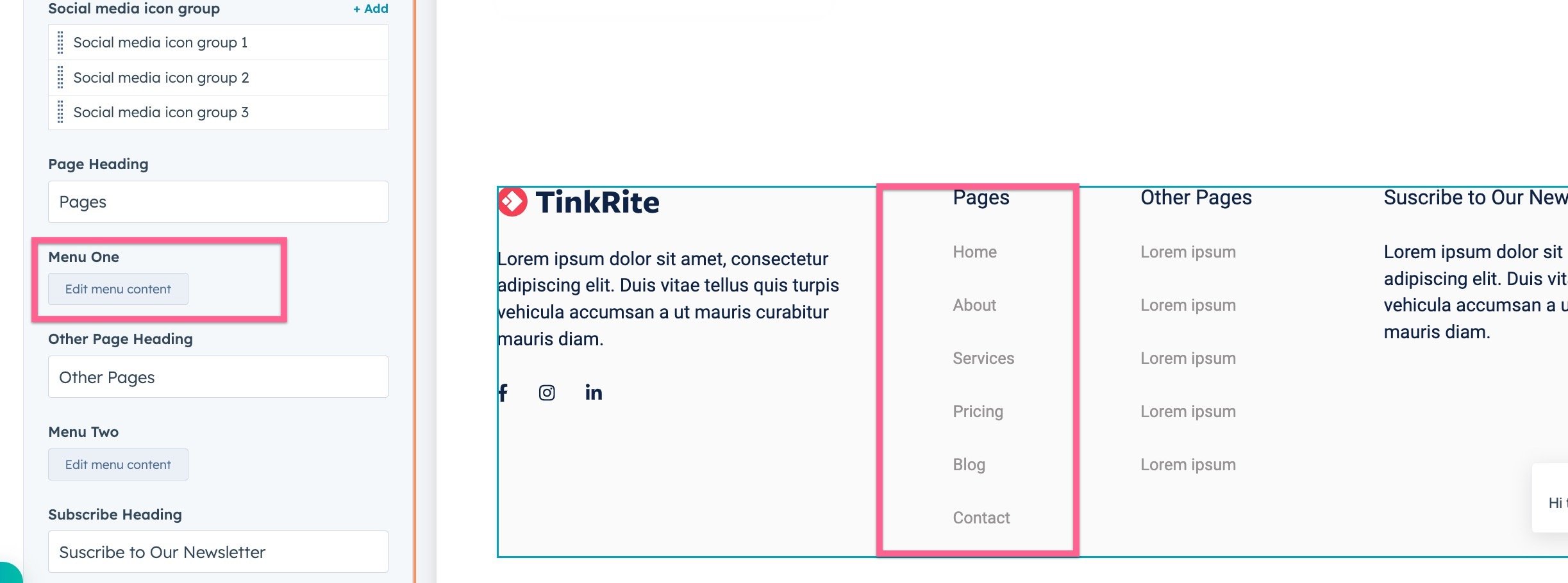
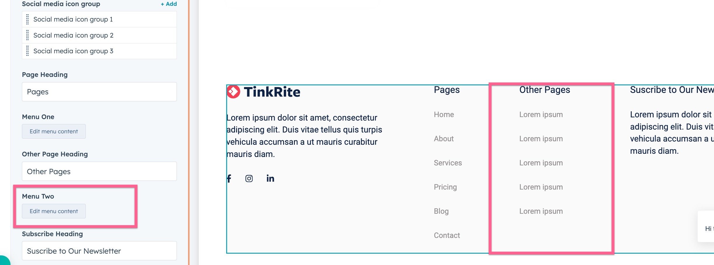
Footer Links
Regarding the Footer links, you will notice these are slightly different from the ones in the Header. Each section has different menus. By clicking on the corresponding menu you can change the link and text, which is the same as in the Header menu. See the screenshots below for Footer menu examples:
Landin page Footer
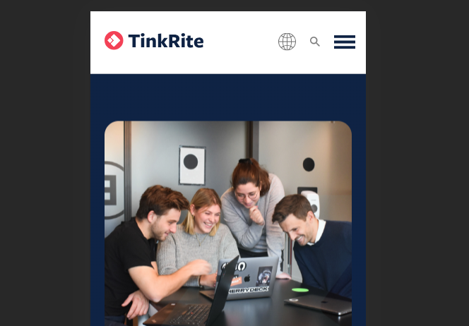
Mobile Menu
language-switcher
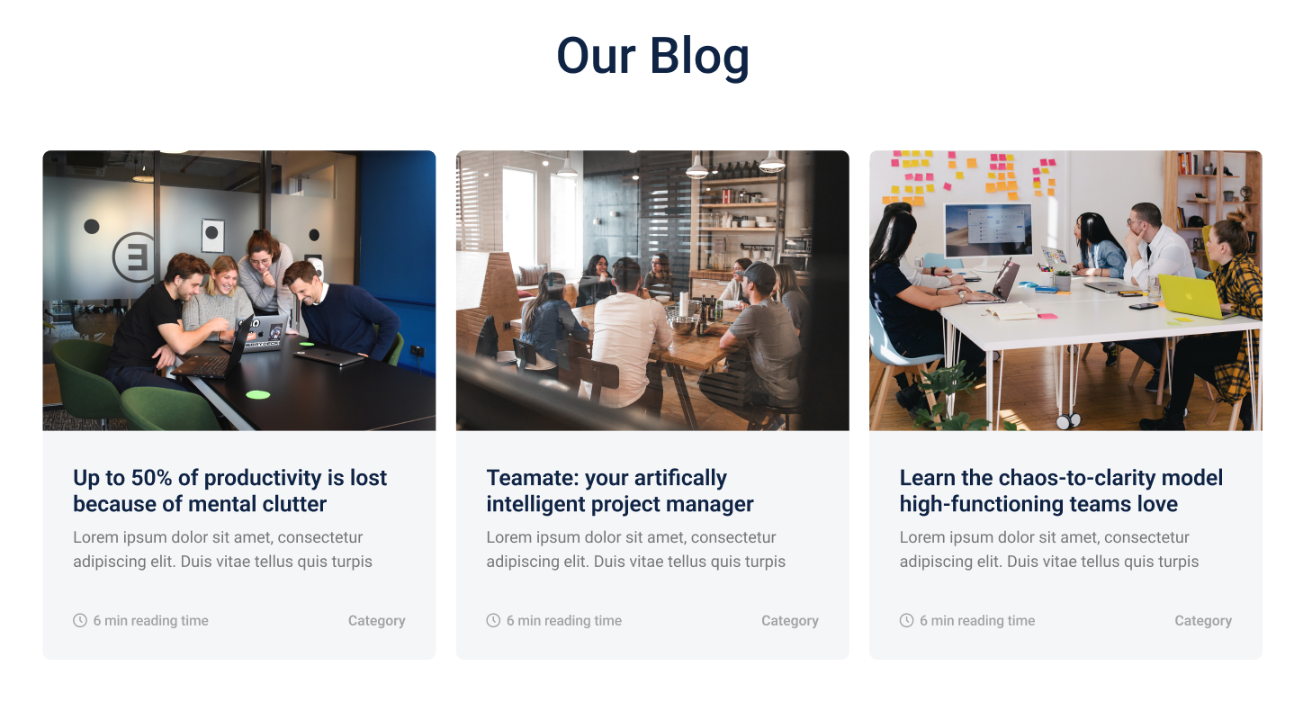
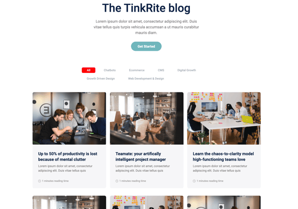
Blog
Blog suggested listings
blog overview listing
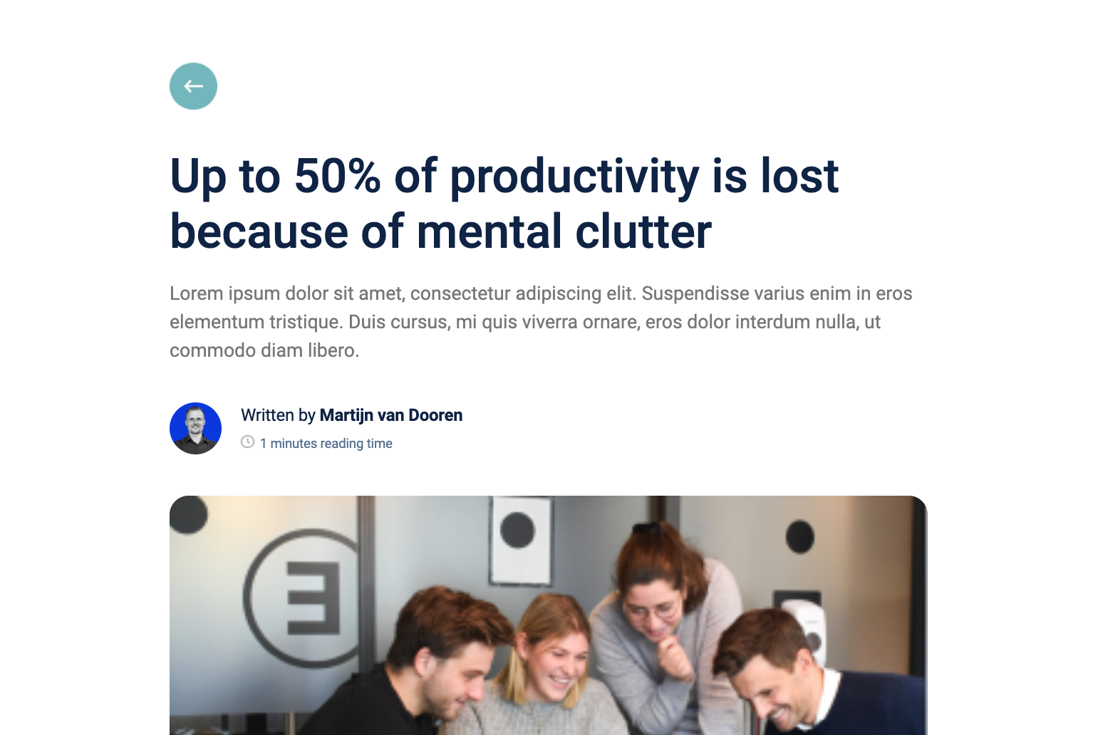
Blog Post Header
Forms and Buttons
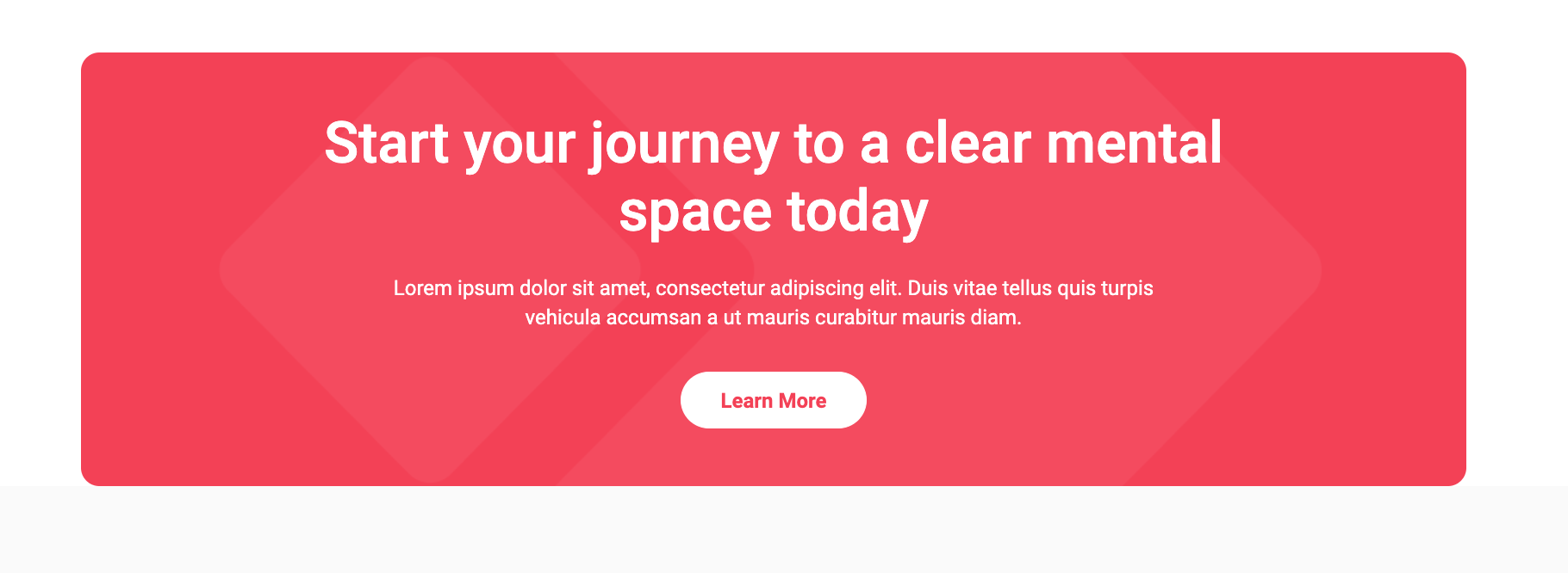
Bottom CTA banner
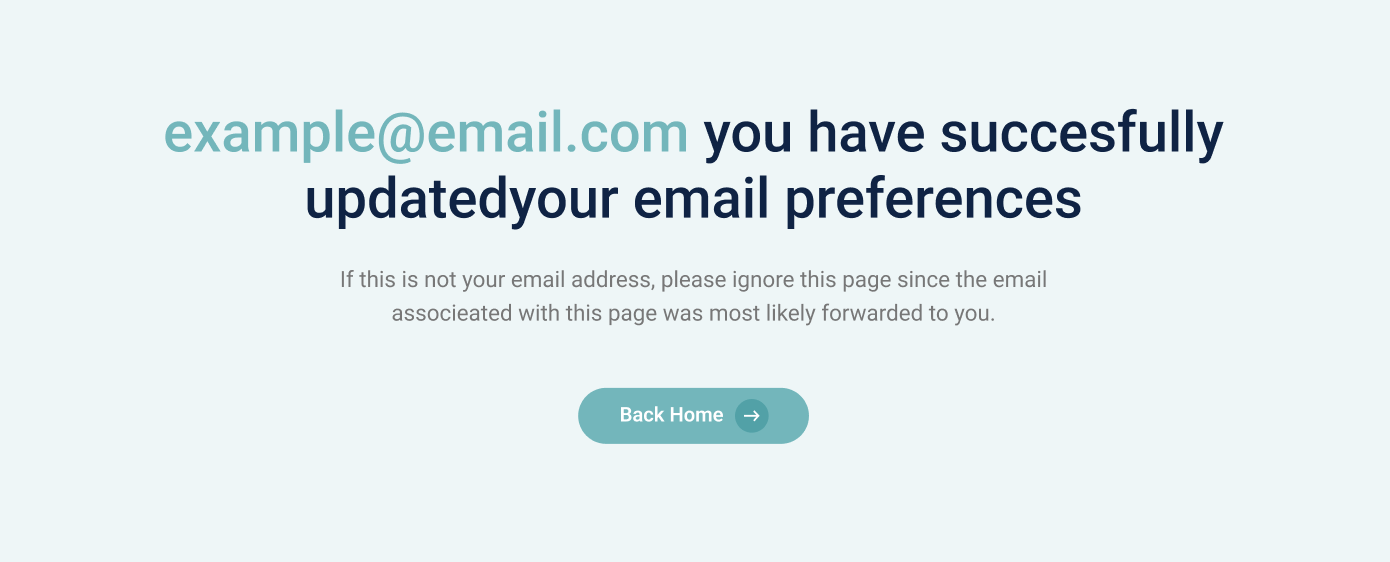
Email subscriptions confirmation
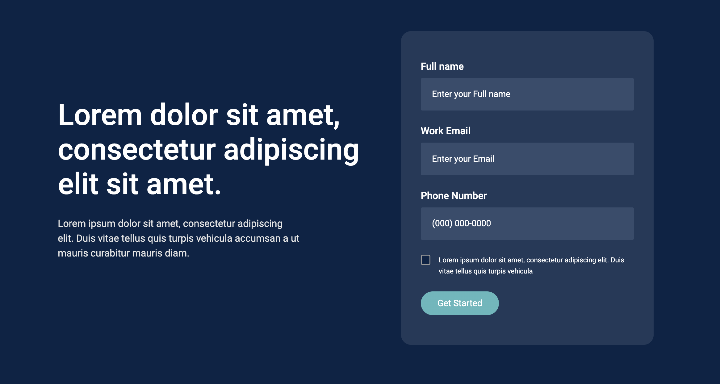
Hero Form
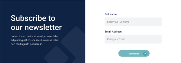
subscription banner
CTA Button

Text
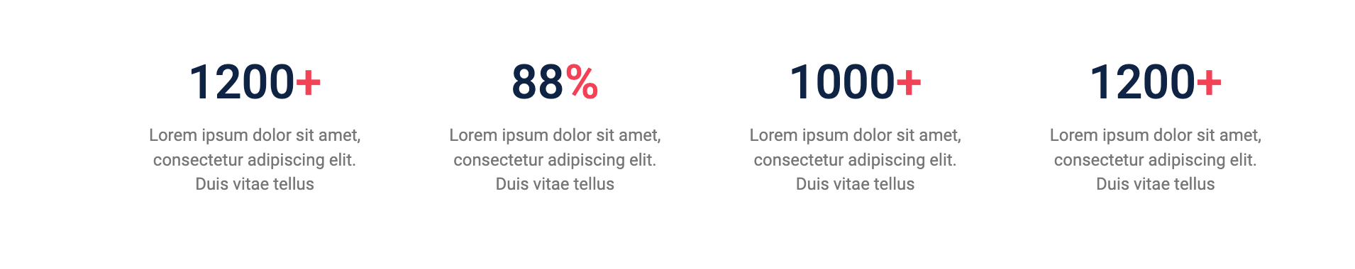
By the numbers
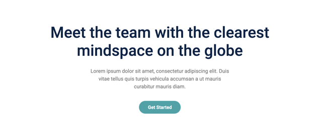
Hero Banner

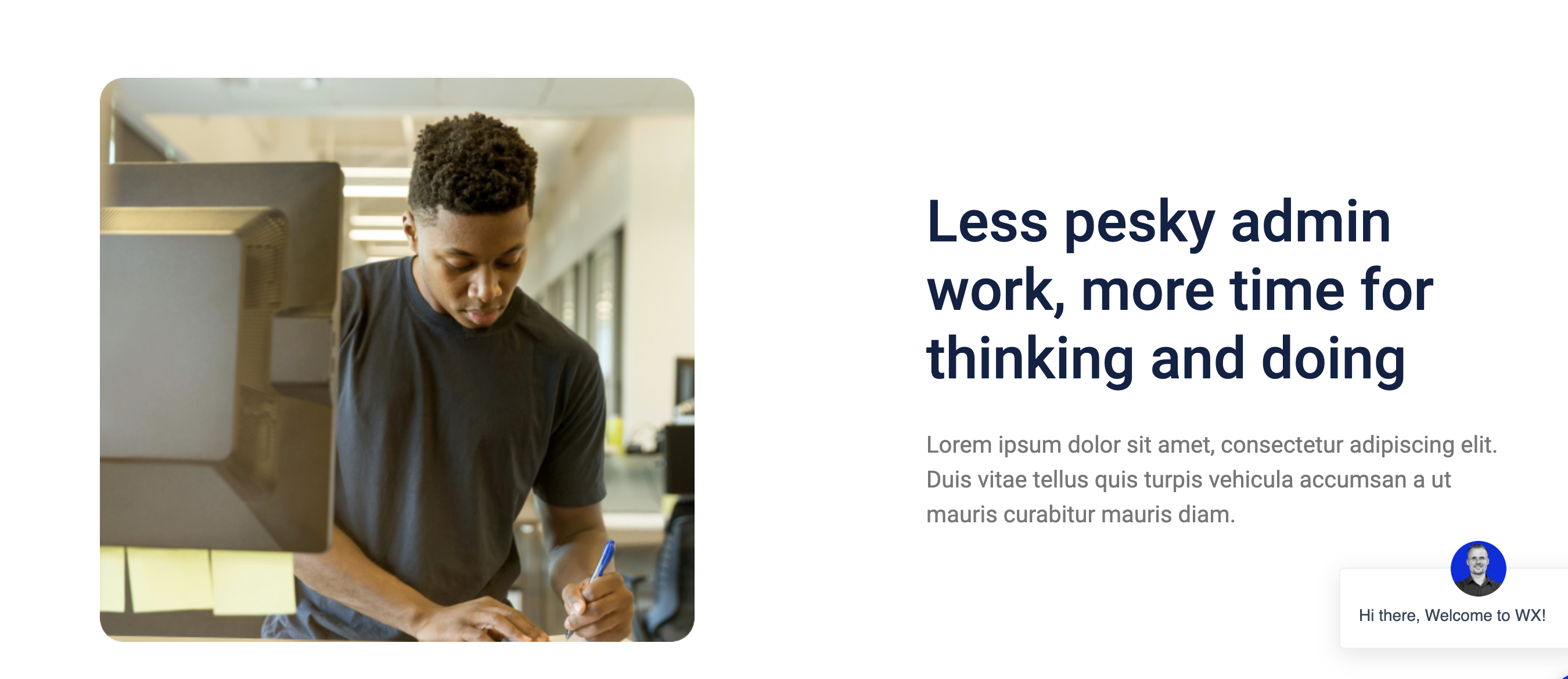
introduction hero banner
Body Content
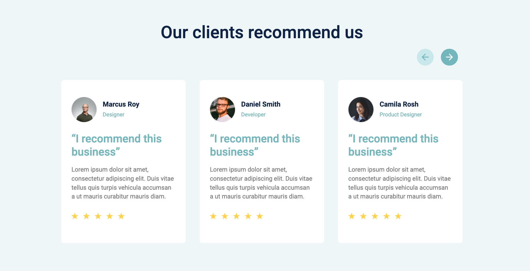
Clients Review Cards
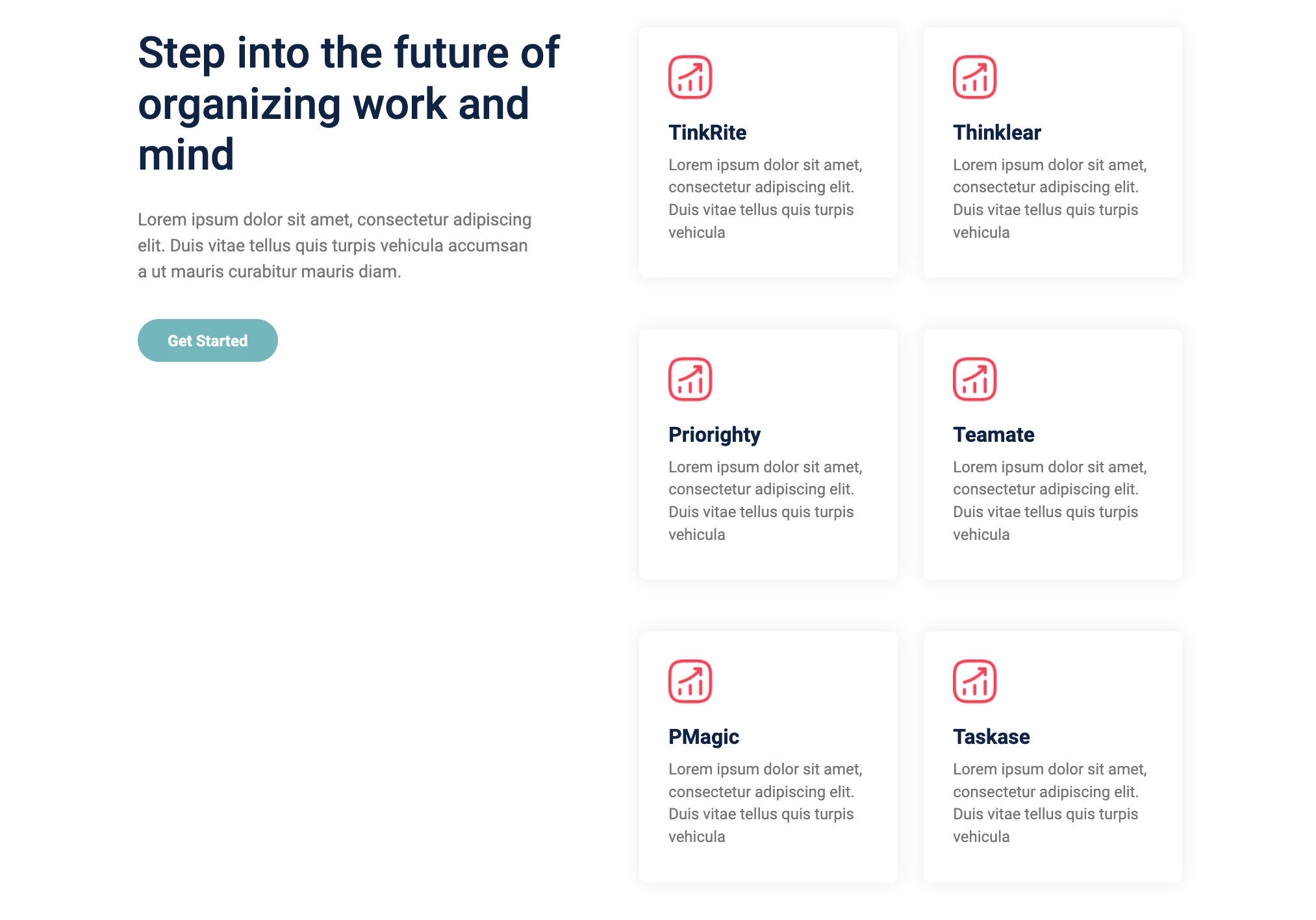
4 Tile Cards
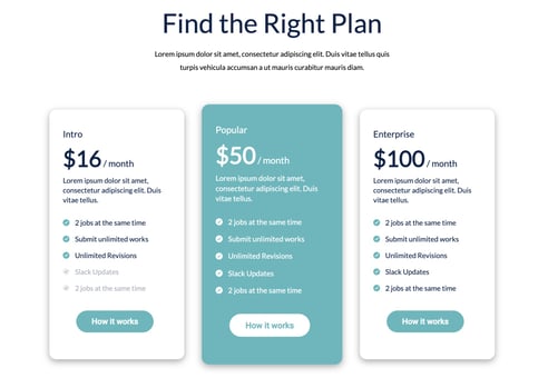
Pricing Cards
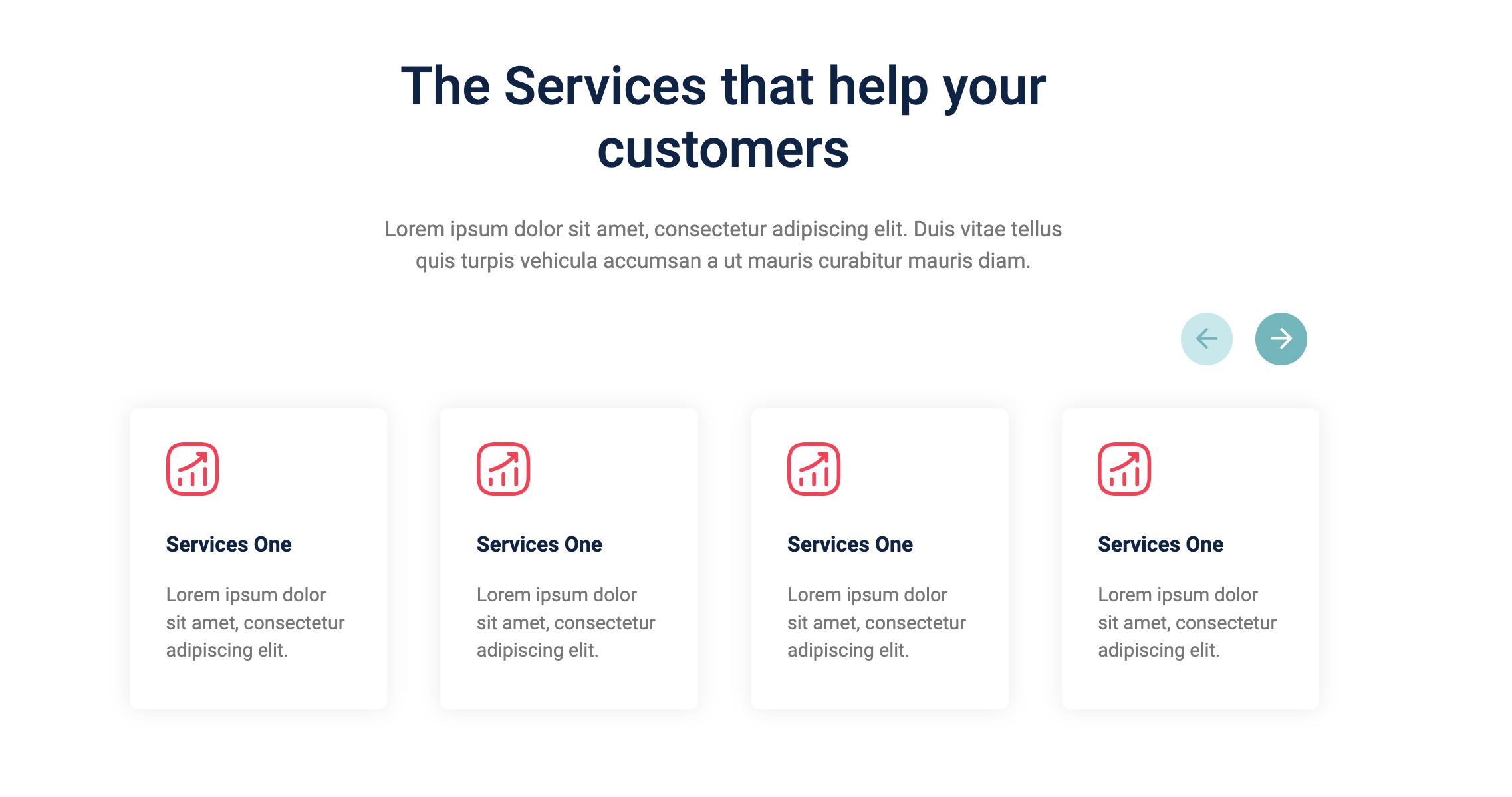
Services Tiles Organizer
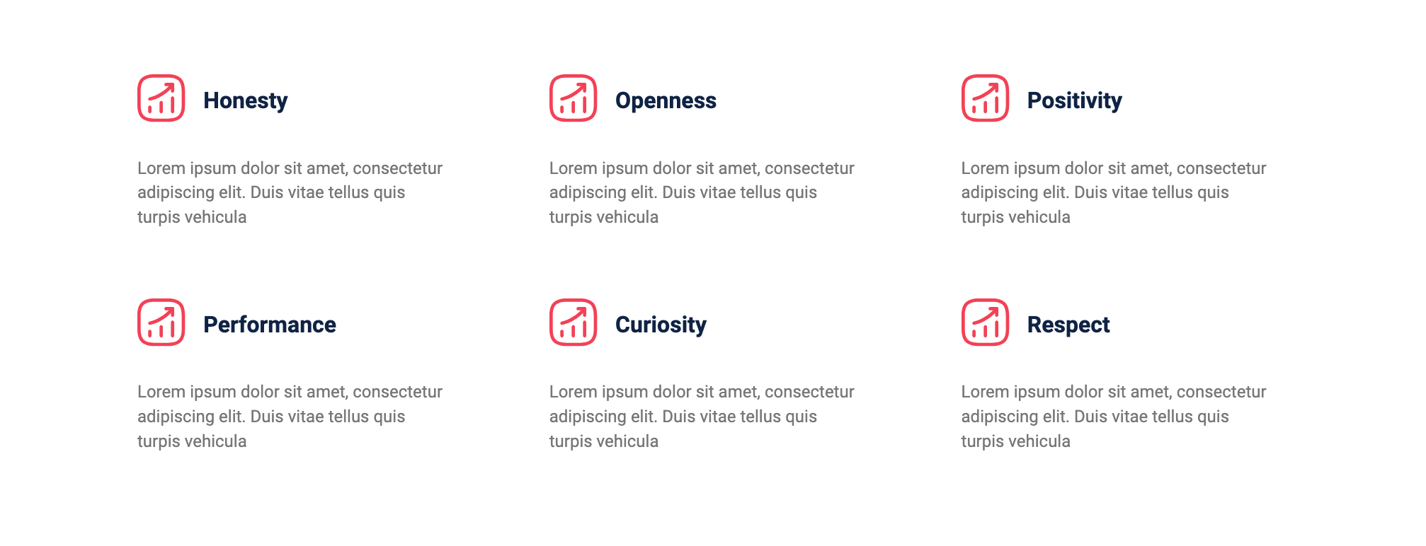
Six key points>
2 Column Layout
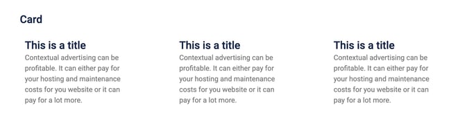
Card
Media
Client logo carousel

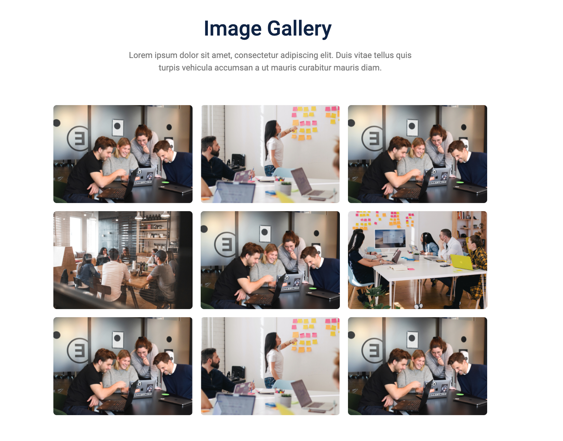
Image Gallery
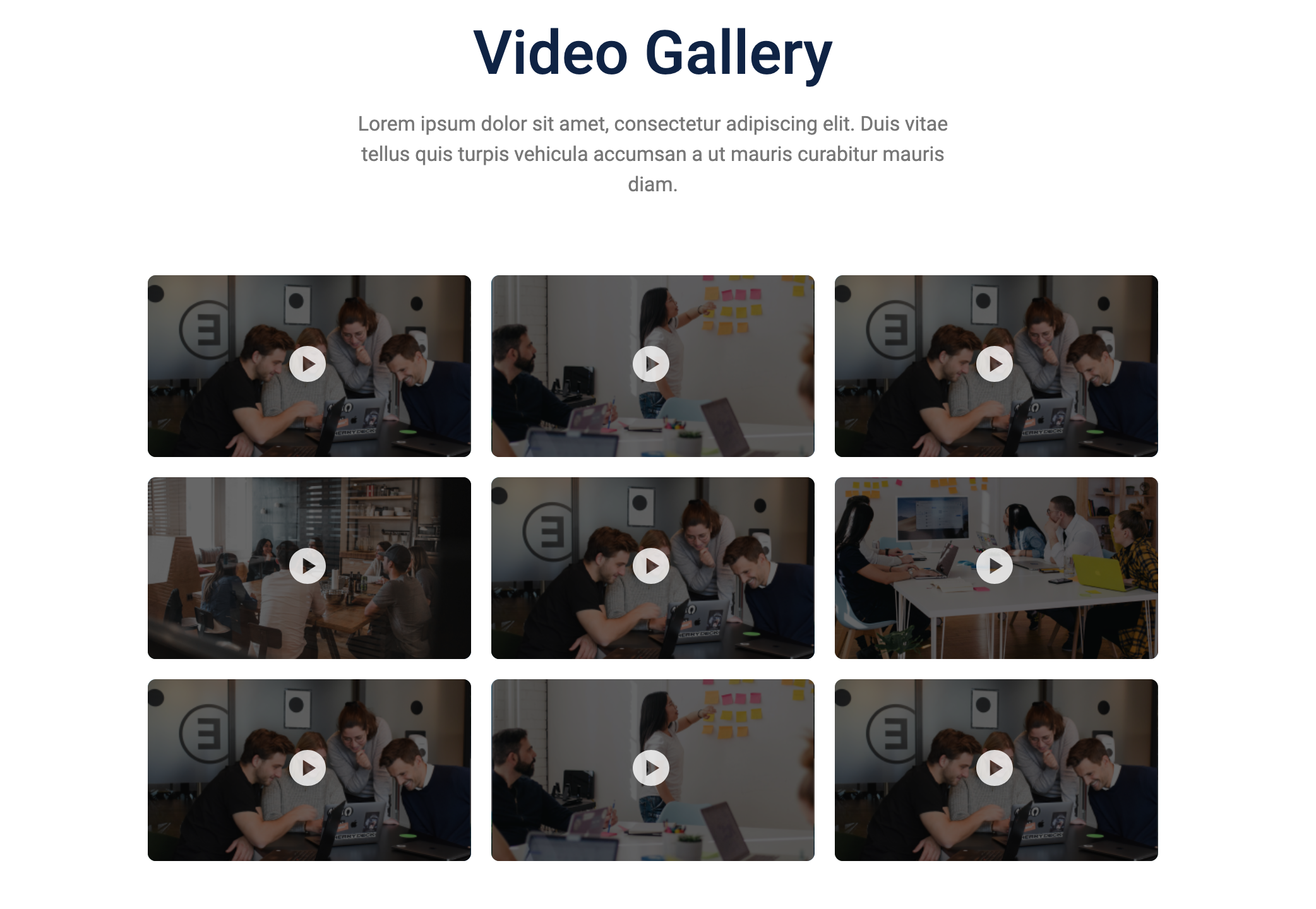
Video Gallery
logo carousel slider

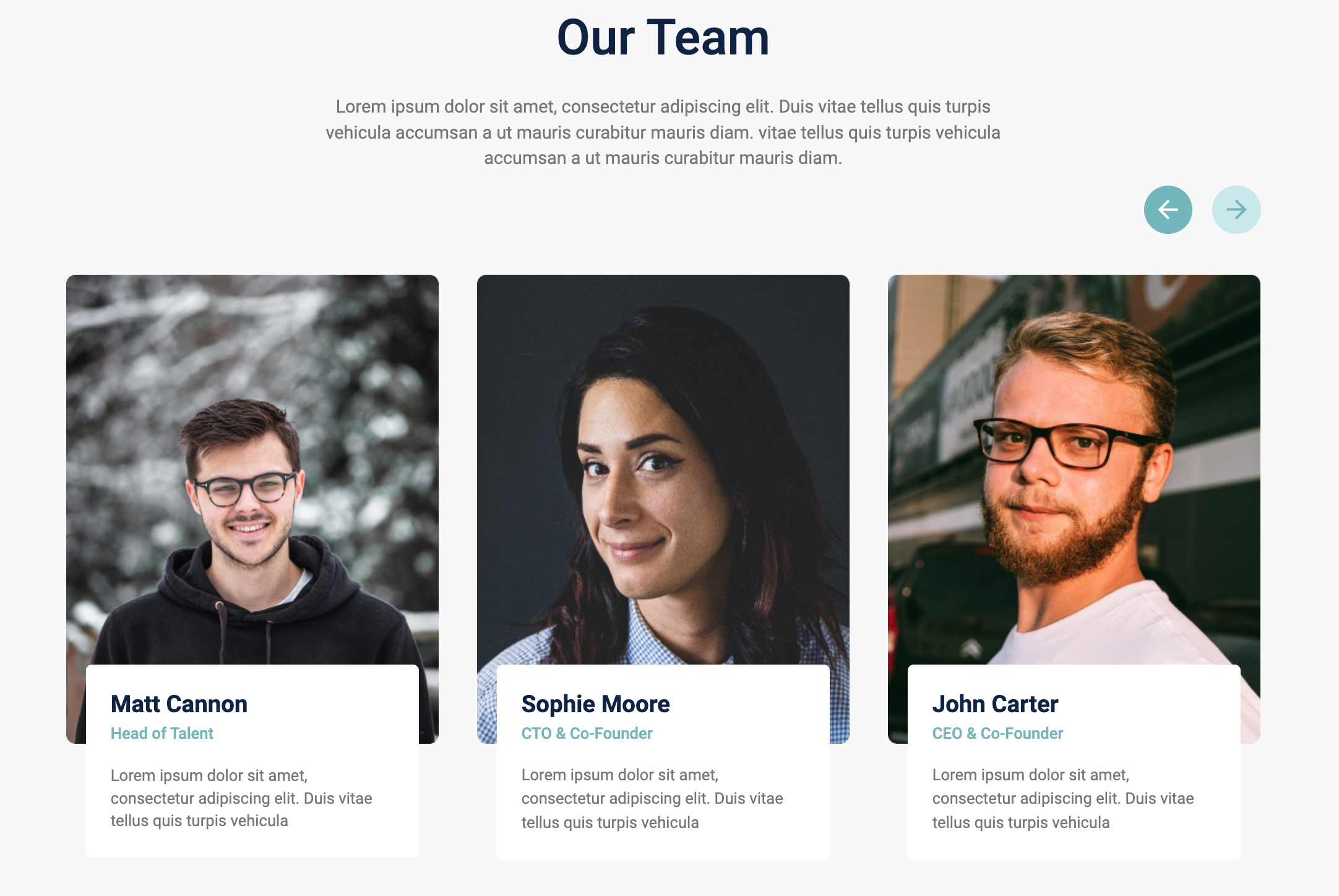
Our Team
Design
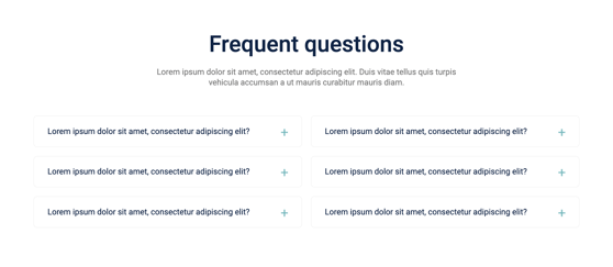
FAQ
Social
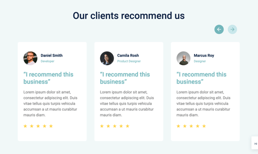
Review cards
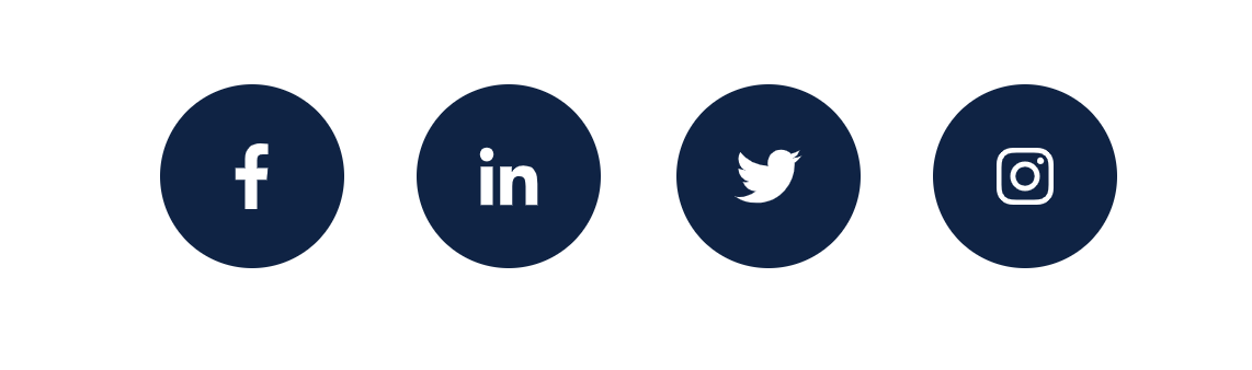
social follow
Functionality
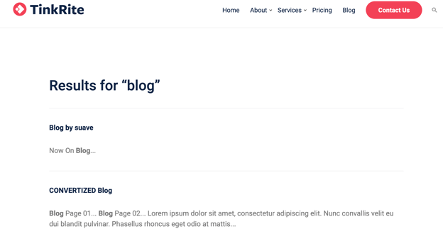
Search input
Search Results
Sticky sidebar
Events Listing (Pro module)
Overview
The Events Module is a dynamic and fully customizable module designed for HubSpot CMS. It allows users to showcase upcoming events with structured details, including the event's date, time, type, and location. The module offers customization options for background styling, spacing, and colors to align with brand aesthetics. It also supports a "More Events" button, linking to additional event details.
Features
-
Display multiple events with date, time, and location
-
Supports both online and offline events
-
Customizable heading, colors, and spacing
-
Background gradient support
-
Optional icons for time and location
-
"More Events" button with customizable link
-
Responsive design for desktop and mobile
Module Fields and Configuration
1. Style Group
These settings control the appearance of the module, including spacing, colors, and background settings.
| Field Name | Label | Type | Description |
|---|---|---|---|
desktop_spacing |
Desktop Spacing | Spacing | Adjusts the spacing for desktop views |
mobile_spacing |
Mobile Spacing | Spacing | Adjusts the spacing for mobile views |
background_color |
Background Color | Gradient | Sets a gradient background with configurable colors and direction |
heading_color |
Heading Color | Color | Defines the color of the heading text |
time_icon |
Time Icon | Image | Upload an image for the time icon representation |
location_icon |
Location Icon | Image | Upload an image for the location icon representation |
box_color_even_ |
Box Color (Even) | Color | Background color for even-numbered event boxes |
box_color_odd_ |
Box Color (Odd) | Color | Background color for odd-numbered event boxes |
2. Content Group
This section allows users to define the event details, including name, date, time, location, and event type.
Heading
| Field Name | Label | Type | Description |
heading |
Heading | Richtext | Displays the main heading for the event section (default: "Upcoming Events") |
Event Details
Each event has structured fields to capture all necessary information.
| Field Name | Label | Type | Description |
date.month |
Month | Text | Specifies the month of the event (e.g., "March") |
date.date |
Date | Text | Specifies the date or date range of the event (e.g., "22-25") |
event_name |
Event Name | Richtext | Name of the event, displayed prominently |
time |
Time | Text | Event timing, formatted as "HH:MM - HH:MM" |
event_type |
Event Type | Choice | Dropdown to select either "Online" or "Offline" event |
location.location |
Location | Text | Physical location of the offline event |
location.location_link |
Location Link | Link | Optional link for the event location (Google Maps, venue website, etc.) |
link |
Link | Link | External link for more event details |
link_text |
Link Text | Text | Custom label for the event details link (e.g., "More Info") |
3. Button Settings
Users can configure an optional button for redirecting visitors to a dedicated events page or external event registration.
| Field Name | Label | Type | Description |
button_required |
Button Required | Boolean | Toggle to show/hide the "More Events" button |
button_link |
Button Link | Link | URL for the button action (visible if button_required is enabled) |
button_text |
Button Text | Text | Custom text for the button label (default: "More Events") |
How to Use
-
Add the module to a HubSpot CMS page.
-
Customize the event details by adding or modifying event entries.
-
Adjust styling options such as colors, spacing, and background.
-
Configure the optional "More Events" button as needed.
-
Save and publish the page to make the event list live.
Notes
-
The location field is only visible if "Offline" is selected as the event type.
-
Background gradients can be adjusted with multiple colors and direction settings.
-
Ensure the date and time formats are used consistently for a professional display.
-
The module is mobile-responsive and adapts to different screen sizes.
Compatibility
-
HubSpot CMS Hub
-
Fully responsive on all devices
Submission Details
This module is designed for HubSpot CMS and follows HubSpot Marketplace guidelines. It offers flexibility for businesses to showcase upcoming events efficiently