5 Signs Your Website is Outdated and Ready For a Redesign

Do you feel you’re not getting the expected results from your website?
Or perhaps, you’re not sure if your website is still up to standards?
While on average, most companies choose to redesign their website every 2 - 3 years, it will really depend on the growth and goals of your business. In this article, we look at 5 of the biggest signs that will tell you if it’s time to seriously consider a website redesign.
Looks vs. Functionality
Website redesign is not just about great looks. The scope of web design has evolved to much more than an adequate presentation of your business. A website is now a tool that can generate new leads for your business, or strengthen the relationship with your current clients. There are a few signs however, that will scream "I’m outdated!".To find out if your website is ready for a redesign, ask yourself the following questions:
1. Does my website look good on mobile devices?
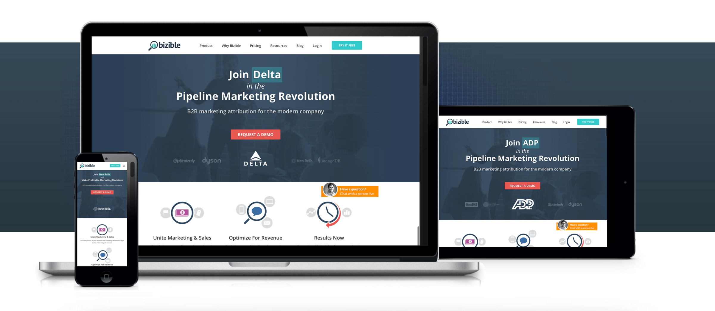
It’s key to have a responsive design that scales equally well on desktop, tablet, and mobile devices. Research showed that 80 percent of Internet users owns a smartphone, and that number will only increase. Responsive design means that website content will automatically switch and scale according to the screen size of your website’s user. If your website is not responsive, it will be large and fixed so users have to pinch to zoom in. Another indicator that you’re website is not ready for mobile, is the use of Flash.
The majority of mobile devices and tablets don’t support Flash and it’s also terrible for search engines to scan. Instead of Flash, a lot of websites use HTML5 for their website animations.
2. Can I easily manage my content?
It should be easy for you to manage your website’s content without the help of a web developer. This way you have the ability to go and update content, or add new pages like a blog article, promotion, or news.
Most websites today are built using a Content Management System (CMS) such as WordPress, Joomla, or the upcoming Hubspot. These systems make it fairly easy to go in and make simple updates and post new pages, even when you’re not web savvy.
3. Are my website’s fonts and colors consistent?
Inconsistent use of fonts: big and small, or many different typefaces, will leave the user dazzled and directionless. Today’s design should be minimal so it’s easy for the user to understand and directs them to a desired action.
The use of too many colors, that don’t rhyme with each other or match your brand, is another clear sign of outdated design. Colors should be consistent over all pages and typically limited to two or three main colors.
4. Does my website convert any leads or sales?
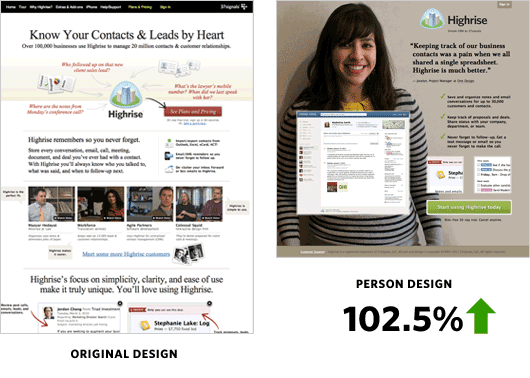
A good example of the advancement in web design is the conscious of a website that should convert. Your business website could be much more than a digital brochure. It could be your biggest marketing and sales channel!
At WX Digital Agency, we create websites that are focused on converting your website’s visitors into leads. Below you will find an illustration of conversion-focused web design.

The full article contains 100 conversion optimization case studies.
5. Do my web pages load fast?
If your website is slow, you are going to lose visitors. This confronting study shows us that 7% of consumers expect a web page to load in 2 seconds or less, and 40% of people abandon a website that takes more than 3 seconds to load!
Website speed is one of the factors that will play a major role in the user experience and especially when you have a first-time visitor. There are several online sources where you can test your website speed, like this one from Google.
If you answered most questions with a ‘no’, it’s probably time to consider a website redesign and explore your options. It’s important to take the right approach to website redesign. Read our next article to gain an understanding of the steps that are important for a smooth process toward your website’s redesign.


